
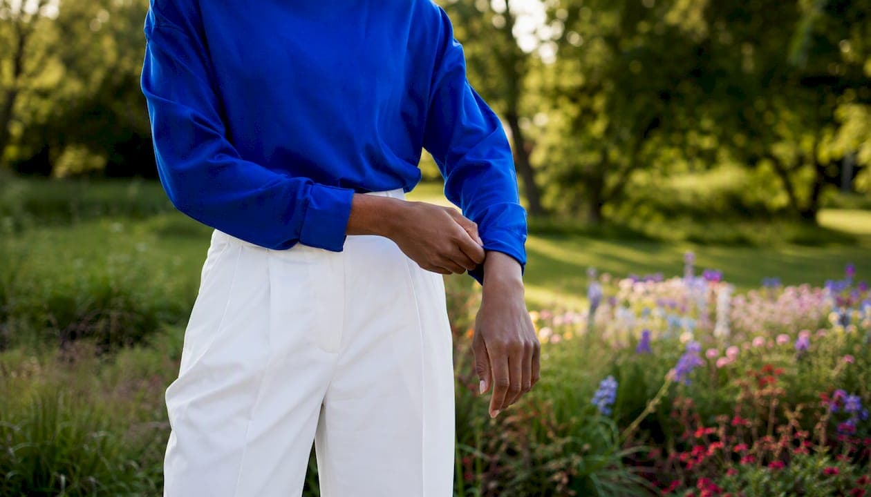
Color blocking is wearing two or three large, solid areas of contrasting color so one shade does the heavy lifting and the others support it. Start today: grab a cobalt blue top, pair it with cream trousers, and you have a color-block outfit. That's genuinely all it takes to begin.
Designers from Yves Saint Laurent to the team at Kennywadesworld have built entire collections around this principle. Pantone's annual color forecasts shape which pairings feel current, and Piet Mondrian's grid paintings from the early 20th century gave the whole idea its visual grammar. You're working within a long, well-tested tradition.
Three ways to start right now:
- Pull one bold piece you already own (a jacket, a sweater, a skirt) and pair it with a single neutral.
- Try a color-block accessory first: a cobalt bag against an all-tan outfit counts.
- Use a rule where one color is clearly dominant and the second covers a smaller portion, creating a balanced proportion between the two.
Table of Contents
- What are color blocking outfits and where did they come from?
- How do you choose colors that actually work together?
- Practical styling rules that stop color-block outfits from going wrong
- How to build a color-block outfit step by step
- Outfit inspiration: 10+ color-block looks across occasions
- What colors and palettes are trending right now?
- What to look for when shopping for color-block pieces
- How Kennywadesworld approaches color blocking
- Shop the look at Kennywadesworld
- Sources
What are color blocking outfits and where did they come from?
Color blocking means wearing large, flat sections of contrasting solid color on the body, with no prints, gradients, or patterns breaking up those areas. The visual effect is graphic and immediate: your eye reads each color zone as a distinct shape, which makes the overall silhouette feel architectural and intentional.
The lineage runs directly through Piet Mondrian. His 1920s grid paintings, with their bold red, yellow, and blue rectangles separated by black lines, gave fashion designers a literal template. Yves Saint Laurent made the connection explicit in 1965 with his Mondrian collection, a series of shift dresses that translated the painter's geometry straight onto the body. That moment put color blocking on the fashion map, and it has cycled back into the mainstream roughly every decade since.
From a color theory standpoint, three relationships drive most successful pairings:
Complementary colors sit opposite each other on the color wheel (blue and orange, red and green). The contrast is high and the visual tension is immediate.
Analogous colors sit next to each other (blue, blue-green, and teal). The contrast is lower, the mood is harmonious, and the look reads as sophisticated rather than bold.
Triadic colors form a triangle on the wheel (red, yellow, blue). Three-way combinations are harder to balance but produce the most energetic outfits when they work.
The practical rule most stylists land on: start with two colors and add a third only once you're comfortable with how proportion works. A two-color outfit is almost always easier to read and easier to wear.
| Rule | Guideline | Why it matters |
|---|---|---|
| Number of colors | 2 to start; 3 maximum for most looks | More than 3 colors rarely reads as intentional |
| Dominant-to-accent split | A dominant color covering a majority with a smaller accent | Keeps one color in charge so the eye has a resting point |
| Two-thirds / one-third split | A larger portion for the dominant color and smaller for the accent | Slightly more dramatic version of the same principle |
| Color relationship | Complementary, analogous, or triadic | Predicts contrast level before you get dressed |
| Saturation matching | Brights with brights; pastels with pastels | Mismatched vibrancy is the most common beginner mistake |
How do you choose colors that actually work together?
The single most useful rule here: match saturation levels. A bright, saturated cobalt paired with a washed-out dusty rose creates visual friction because the two colors feel like they belong to different outfits. Pair that cobalt with a sharp chartreuse instead, and both colors feel like they're playing the same game.
Skin tone as a starting point
Warm skin tones (golden, olive, or peachy undertones) tend to pop against earthy colors: rust, terracotta, warm yellow, and olive green. Cool skin tones (pink or bluish undertones) read well against jewel tones: cobalt, emerald, plum, and icy lavender. Neutral undertones have the most flexibility and can usually carry both warm and cool palettes. These are starting points, not rules you're locked into.
Three palette examples by occasion
Everyday: Cobalt blue top + cream wide-leg trousers. The cobalt is the hero; the cream keeps it grounded without competing. Works for errands, coffee, or a casual lunch.
Office: Rust-orange blazer + camel trousers + a white shirt underneath. The rust and camel are close enough on the color wheel to feel polished, and the white shirt acts as a clean break at the collar. Nothing about it reads as costume.
Evening: Emerald green midi dress + a deep burgundy clutch and heels. Two colors, high contrast, both fully saturated. The accessories carry the second color so the dress stays the focal point.
For resort and vacation occasions, coral with warm white or cobalt with sandy beige tends to photograph especially well in natural light.
The nervous-beginner palette
One neutral base (white, black, camel, or cream) plus one pop color. Wear the neutral as the dominant piece (trousers, a skirt, or a coat) and let the pop color sit on top. You get the structural impact of color blocking without committing to two bold pieces at once. Stylists consistently recommend this as the lowest-risk entry point.
Practical styling rules that stop color-block outfits from going wrong
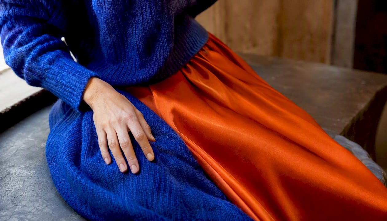
Most color-blocking failures come down to three specific problems: mismatched saturation (covered above), too many colors fighting for attention, and fabric weights that clash. A heavy wool sweater in cobalt paired with a silk slip skirt in orange creates a texture disconnect that makes the outfit feel accidental even when the colors are right. Keep fabric weights in the same general register: both casual, both structured, or both fluid.
Proportion and silhouette
Think of your outfit as having three roles: a dominant color (the hero, covering the most body area), a supporting color (the second-largest area), and an optional accent (a small echo in an accessory or shoe). The two-thirds dominant / one-third accent split is the most practical version of this. When the split is closer to 50/50, the eye doesn't know where to land, and the outfit can read as two separate looks stapled together.
Silhouette matters too. A color-block outfit where the break between colors falls at a flattering horizontal line (the natural waist, the hip, or the knee) tends to look more intentional than one where the break lands mid-torso or mid-thigh by accident. Before you leave the house, check where the color boundary sits on your body.
Accessories as connectors
Accessories are the easiest way to tie a color-block outfit together. A belt in one of the outfit's existing colors pulls the look into a single unit. A bag that picks up the accent color creates a visual echo that makes the whole thing feel planned. Two-tone shoes (say, a white and cobalt sneaker) can bridge two colors in a single piece. Bold accessories are also the lowest-commitment way to try color blocking before investing in full garments.
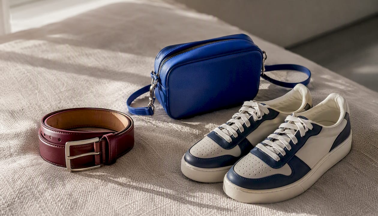
Pro Tip: Use a thin neutral break at the waist, a white belt, a cream-colored waistband, or even a tucked-in white tee, to separate two bold colors that are fighting each other. The neutral acts as a visual comma, giving each color its own space and making the pairing read as deliberate rather than accidental.
How to build a color-block outfit step by step
The process is repeatable once you understand the logic. Follow these steps and you can create balanced outfits:
- Choose a hero piece with the most visual weight.
- Pick a supporting color using the color wheel and match saturation.
- Check that one color is clearly dominant to create balance.
- Add a small echo of the supporting color in an accessory.
- If something feels off, remove a piece rather than adding more colors, as less is often more.
Three outfit recipes
Casual: Oversized rust-orange hoodie (hero) + cobalt blue joggers (support) + white sneakers (neutral anchor). The white sneaker keeps the look from tipping into costume territory.
Office: Camel blazer (hero) + white trousers (neutral support) + emerald green pumps and a matching clutch (accent echo). Two colors, one neutral, one accent. Clean and confident.
Evening: Deep plum midi skirt (hero) + ivory silk blouse (neutral) + cobalt blue heeled mule and a cobalt clutch (accent). The cobalt appears twice, which is what makes it feel intentional.
Pre-outfit checklist
Before you leave or post the photo, run through this quickly:
- Is one color clearly the dominant (covering more body area than the other)?
- Do the saturation levels match (both bright, both muted, or both pastel)?
- Is there a small color echo somewhere in the accessories?
- Does the color break fall at a flattering horizontal line on the body?
- Are the fabric weights in the same general register?
Outfit inspiration: 10+ color-block looks across occasions
These are short outfit cards you can copy directly. Each one lists the pieces, where the color sits, and a quick modification.
1. Cobalt + Cream (Casual) Cobalt oversized tee (hero, top) + cream wide-leg trousers (support, bottom). Best for: weekend errands. Colors: 2. Contrast: high. Modify: swap the tee for a cobalt linen shirt for a slightly more polished version.
2. Rust + Camel (Office) Rust blazer (hero, top) + camel tailored trousers (support, bottom). Best for: office or client meeting. Colors: 2. Contrast: low-medium. Modify: add a white shirt underneath to create a three-color look with a neutral anchor.
3. Emerald + Ivory (Evening) Emerald satin midi dress (hero, full body) + ivory strappy heels and clutch (accent, accessories). Best for: dinner or event. Colors: 2. Contrast: medium. Modify: swap ivory for gold for a warmer, more festive feel.
4. Cobalt + Chartreuse (Color Block Streetwear) Chartreuse cargo pants (hero, bottom) + cobalt zip-up jacket (support, top). Best for: street style or concert. Colors: 2. Contrast: very high. Modify: add white sneakers to ground the pairing.
5. Plum + Cobalt (Evening) Deep plum midi skirt (hero, bottom) + cobalt silk blouse (support, top) + cobalt heels (echo). Best for: cocktail event. Colors: 2 plus echo. Contrast: high. Modify: use a plum bag instead of cobalt heels for a subtler echo.
6. Terracotta + Olive (Casual, Gender-Neutral) Olive wide-leg trousers (hero, bottom) + terracotta crewneck sweatshirt (support, top). Best for: casual outings, gender-neutral styling. Colors: 2. Contrast: low-medium. Modify: layer a cream overshirt for a three-color analogous look.
7. Lavender + White (Office, Soft Palette) White tailored trousers (hero, bottom) + lavender structured blazer (support, top). Best for: creative office or brunch. Colors: 2. Contrast: low. Modify: add a lavender bag to reinforce the echo.
8. Red + Navy (Classic, Occasion-Flexible) Navy wide-leg trousers (hero, bottom) + red fitted turtleneck (support, top). Best for: casual to smart-casual. Colors: 2. Contrast: high. Modify: swap the turtleneck for a red silk blouse to move it toward evening.
9. Mustard + Burgundy (Fall, Gender-Neutral) Burgundy straight-leg trousers (hero, bottom) + mustard oversized knit (support, top). Best for: fall casual or weekend. Colors: 2. Contrast: medium. Modify: add a cream scarf as a neutral break.
10. Cobalt + White + Rust (Three-Color Look) White linen trousers (dominant, bottom) + cobalt linen shirt (support, top) + rust leather belt and rust loafers (accent, accessories). Best for: summer casual or color-forward golf fashion. Colors: 3. Contrast: medium-high. Modify: drop the rust accessories and keep it as a two-color look for a cleaner result.
11. Sage + Cream (Soft, Beginner-Friendly) Cream wide-leg trousers (hero, bottom) + sage green linen blazer (support, top). Best for: first color-block attempt. Colors: 2. Contrast: low. Modify: add a sage green bag to reinforce the palette.
What colors and palettes are trending right now?
2026 runway reporting confirms a strong color-blocking moment, with designers leaning into high-contrast pairings that would have felt risky five years ago. The combinations getting the most runway real estate: cobalt blue with chartreuse, rust with cobalt, and deep plum with ivory. What makes these pairings work is that each one pairs a warm tone with a cool one, which creates tension without chaos.
Pantone's color-of-the-year commentary continues to shape which palettes feel wearable versus dated. When Pantone leans toward warm, earthy tones (as it has in recent cycles), rust, terracotta, and warm olive tend to feel current. When the forecast shifts cooler, cobalt, lavender, and sage move to the front of the conversation. Checking the current Pantone direction before building a new palette is a quick way to make sure your choices feel of-the-moment rather than a season behind.
Designers are also using neutrals strategically: a bold color-block look offset by a cream or white section reads as more wearable and more modern than wall-to-wall saturated color. That's a shift from earlier color-blocking eras, where the goal was maximum coverage.
| Palette name | Mood | Best occasion |
|---|---|---|
| Cobalt + Chartreuse | High-energy, graphic | Street style, concerts |
| Rust + Cobalt | Warm-cool tension | Casual, creative office |
| Plum + Ivory | Sophisticated, evening | Dinner, events |
| Sage + Cream | Soft, approachable | Office, brunch |
| Terracotta + Olive | Earthy, gender-neutral | Weekend, casual |
| Mustard + Burgundy | Rich, autumnal | Fall casual, travel |
For seasonal wardrobe planning, building around a few anchor pieces in trending palettes and rotating accessories to shift the mood is a practical approach that keeps the investment manageable.
What to look for when shopping for color-block pieces
Shopping for color-block fashion requires a slightly different checklist than shopping for prints or neutrals, because the color itself is the design. A few things matter more than usual.
Before you buy, check:
- Fabric weight: Does it match the other pieces you plan to pair it with? A heavy structured blazer and a flimsy jersey skirt will look mismatched even if the colors are perfect.
- Color fastness: Bold colors, especially cobalt, rust, and deep plum, can bleed in the wash. Check the care label and wash dark colors separately the first few times.
- How the color reads in real life: Product photography often oversaturates colors. Read the reviews, look for customer photos, and if possible, check the return window before ordering.
- Return policy: Color-block pieces are harder to style if the shade is slightly off from what you expected. A generous return window (30 days or more) matters more here than with neutral basics.
- Fit at the color boundary: Where the color break falls on your body changes how the silhouette reads. Check that the seam or hem line hits at a flattering point for your proportions.
How to prioritize your purchases
Buy the hero piece first. A bold jacket, a color-block dress, or a statement skirt gives you the anchor around which everything else is built. Once you have the hero, you can find supporting pieces in neutral or complementary tones without spending much. A $15 cream tank top can support a $120 cobalt blazer just as effectively as an expensive one.
Where to invest: outerwear (coats and blazers hold their shape and get the most visibility) and shoes (a cobalt or rust shoe can anchor multiple outfits). Where to save: basics in supporting colors, since the color is doing the work, not the construction.
Kennywadesworld carries casual wear pieces built around bold, deliberate color choices, including tops and outerwear in the brand's signature deep burgundy and electric blue palette. These pieces are designed to work as hero items or supporting pieces depending on how you build the rest of the outfit.
How Kennywadesworld approaches color blocking
The brand's visual identity is built on exactly the kind of contrast that makes color blocking work: deep burgundy against electric blue. That pairing is complementary in spirit (warm against cool, rich against bright) and it photographs with the kind of graphic clarity that makes color-block outfits land on camera.
In practice, Kennywadesworld pieces are styled with a 60/40 logic baked into the design. The dominant color covers the larger garment area, the accent appears at the collar, cuffs, or hem, and the silhouette is kept clean, so the color does the talking. Cuts tend toward relaxed but structured, which means the pieces work as hero items in a casual color-block outfit without needing to be dressed up to look intentional.
The brand also integrates Kenny's musical identity into the aesthetic. Bold color choices in fashion and bold sound choices in music operate on the same principle: contrast creates energy, and energy holds attention.
Kenny's take on why color blocking matters
Color blocking isn't just a trend that comes back every decade. It's a way of dressing with intention, of making a choice about what you want people to see first. Most people default to neutrals because neutrals feel safe, but safe rarely feels memorable.
The connection to music is direct: in a track, you layer sounds that create contrast, tension, and resolution. In an outfit, you layer colors that do the same thing. Kenny Wade's World exists at that intersection, where the energy of the music and the energy of the clothes reinforce each other. The burgundy-and-blue palette isn't arbitrary. It's the visual equivalent of a hook.
Shop the look at Kennywadesworld
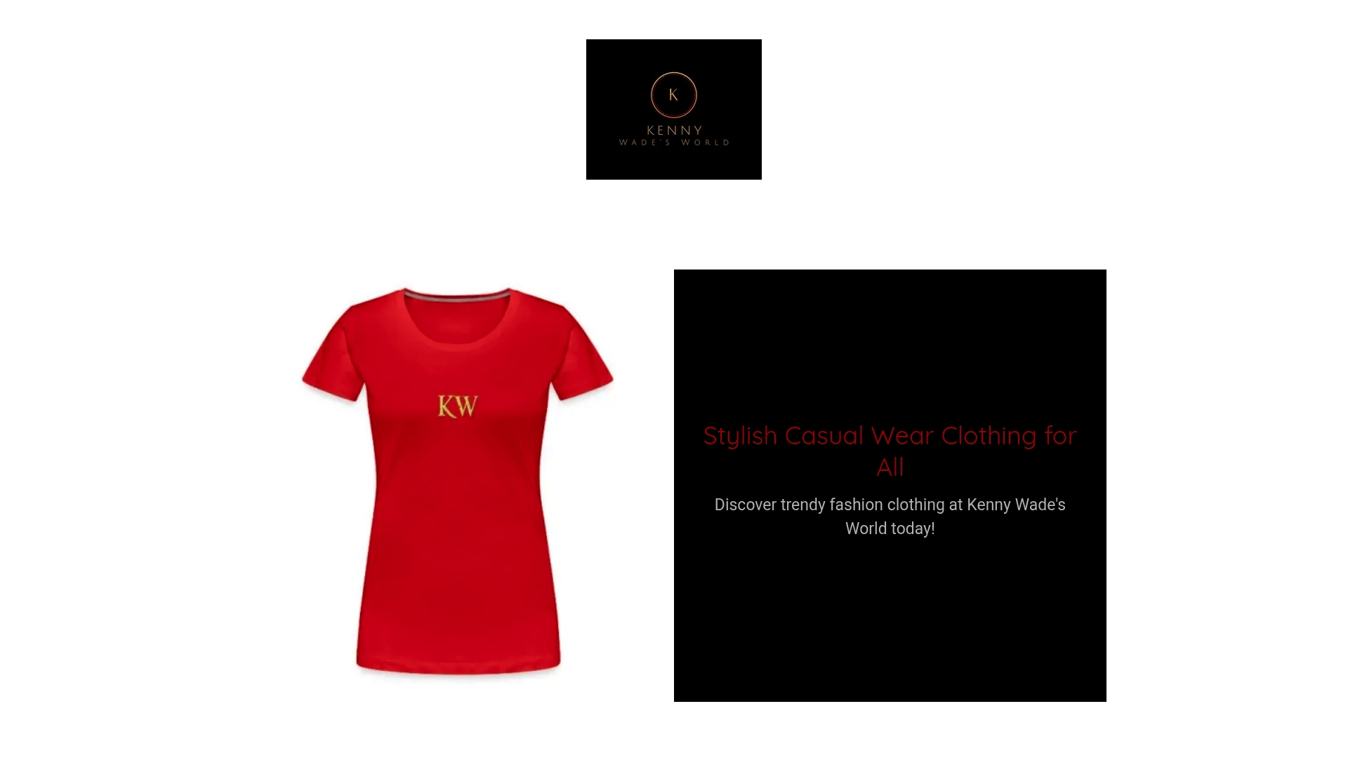
Kennywadesworld makes it easy to start color blocking without building a wardrobe from scratch. The brand's signature pieces in deep burgundy and electric blue are designed to work as hero items right out of the box. A beginner starter set that works: one bold Kennywadesworld top or jacket (your hero piece) paired with neutral bottoms you already own, plus one accessory in the supporting color to create the echo.
Sizing is straightforward, and the relaxed-but-structured cuts mean most pieces work across a range of fits. If the color reads differently on screen than in person, the return process is simple. Check the product pages for current sizing guides and return windows before ordering.
Browse the full catalog and find your hero piece at Kennywadesworld.
Key Takeaways
Color blocking works best when one color is clearly dominant, saturation levels match, and a small color echo ties the outfit together.
| Point | Details |
|---|---|
| Start with two colors | Use a 60/40 or two-thirds/one-third split; add a third color only once you're comfortable with proportion. |
| Match saturation levels | Pair brights with brights and pastels with pastels to keep the look cohesive. |
| Use a small color echo | Repeat the accent color in an accessory (bag, shoe, or belt) to make the outfit feel planned. |
| Neutrals are a tool | A neutral break at the waist or a neutral base piece makes bold pairings more wearable, not less bold. |
| Kennywadesworld as your hero piece | The brand's burgundy-and-blue pieces are built to anchor a color-block outfit as the dominant hero item. |
Sources
These are the core references behind this guide, each worth bookmarking if you want to go deeper on any section.
- What Is Colorblocking? How to Wear This Timeless Trend
- Color-blocking
- Color Blocking Outfits: How to Get It Right
- Color Blocking Outfit Ideas 2026